In 2019, the RTL ZWEI TV broadcast station underwent a significant rebranding process, with the new design aimed at a target audience between the ages of 14 and 29.
The redesign was led by the team at mehappy in Munich, Germany, which I was a core part of. The new look was intended to be fresh, edgy, and flashy, while also being modern and timeless.
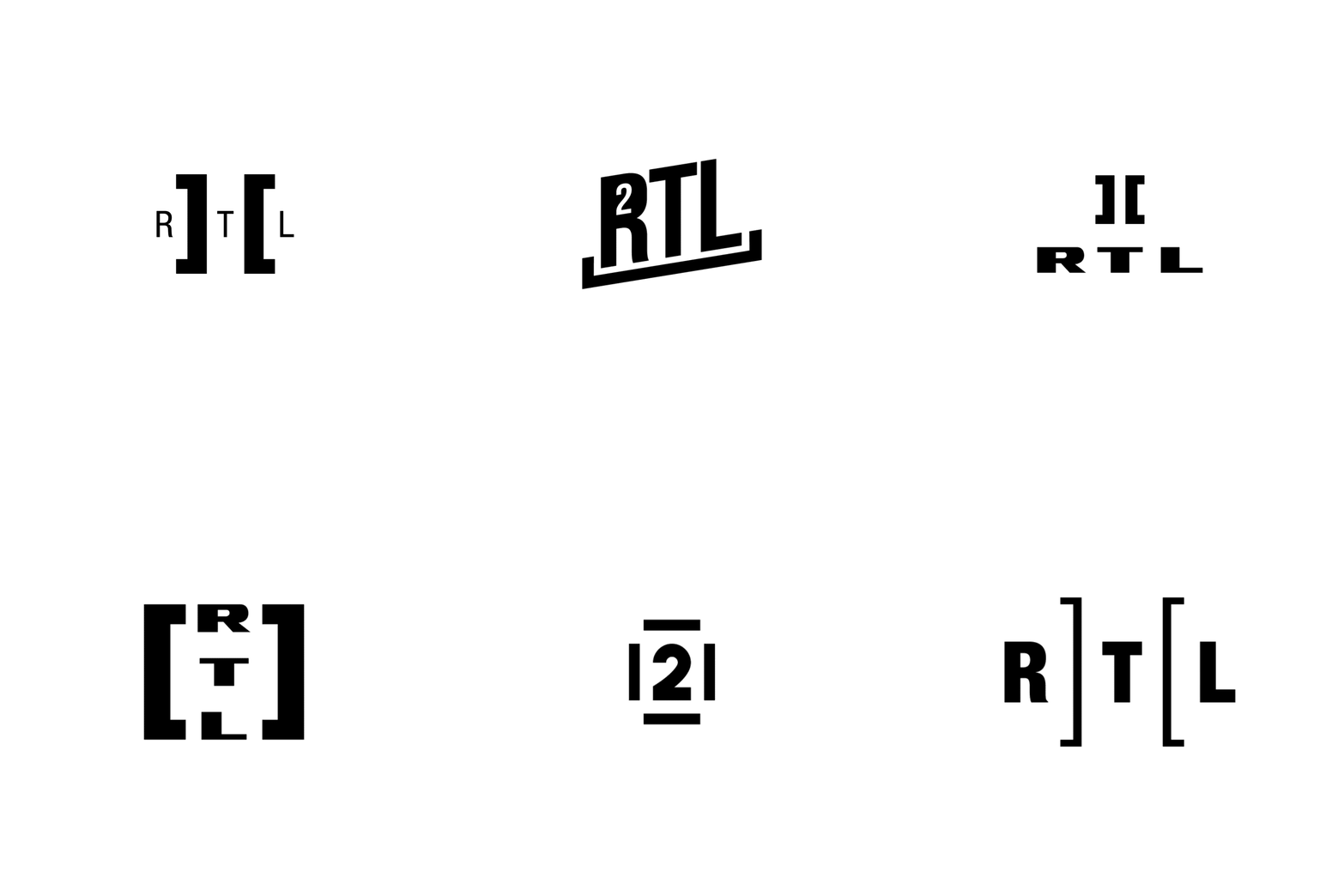
The most notable change to the brand was the redesign of the circular logo that had been in use since 1999. The new logo features two brackets that hold the vertical lines of the original design, giving it a more contemporary and dynamic look. This new icon and wordmark form the basis of the rebrand, and the design elements were carried throughout the entire on-air promotion package. By using the bracket mechanic in the design of the on-air promotion package, every program on the channel has a consistent and dynamic look. This means that viewers can instantly recognize which channel they are watching as soon as they see the design, which is crucial for creating a strong brand identity.
Overall, the RTL ZWEI rebrand was a success, with the new design capturing the energy and spirit of the target audience while also maintaining a timeless quality. The new branding helped the channel stand out in a crowded marketplace, and it continues to be a recognizable and effective design to this day.


